Five of college football's most infamous uniforms of the 21st century
A look at five college football uniforms that drew the most criticism this century, from Michigan State's neon look to Florida's Gatorskin design and Georgia's Pro Combat experiment.
Some of college football's most memorable uniforms of the modern era are memorable for all the wrong reasons. With another season approaching, a retrospective of the sport's most criticized looks from the 21st century has resurfaced five designs that drew widespread mockery from fans, rivals and even the teams that wore them.
Michigan State appears near the top of the list with a neon look that clashed with the program's traditional identity. The uniform featured a bright green jersey with oversized «STATE» lettering across the chest and matching highlighter-green pants in a slightly different shade. A neon version of the Sparty logo completed a combination that critics said looked more like a video-game alternate uniform than the disciplined, hard-nosed image associated with the Spartans. The design was widely compared to a Seahawks-style look imagined by a young fan.
Florida's «Gatorskin» uniform was introduced for a 2017 game against Texas A&M. It was intended to evoke the alligator mascot and the atmosphere of the Swamp, with a scale pattern on the jersey, mismatched pants and orange lettering. The reaction was immediate and negative, and the uniform has not been used since. It became one of the most infamous looks in Florida history, even among a program that has occasionally experimented with alternate designs.
Georgia's entry came at the 2011 Chick-fil-A Kickoff against Boise State, when Nike's Pro Combat series reworked the Bulldogs' classic uniform. The alternate featured a gunmetal-gray helmet with a wide red stripe, black sleeves and a look that did not fit the program's traditional color scheme. The night also ended badly on the field, with Georgia losing to Boise State in Atlanta, and the uniform was effectively retired after that game.
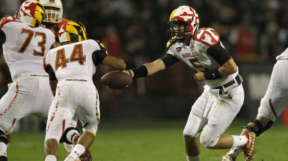
Maryland's early-2010s design covered the team in the state flag's bold patterns, one of the busiest flags in the country. The mash of yellow, red, black and white appeared on jerseys, pants and helmets, and fans joked that the look was hard on the eyes. The retrospective notes that Maryland has a distinctive mascot in the terrapin, but the uniform gave it almost no role.
Iowa State rounds out the list with its so-called «Pooh Bear» uniform, which drew some of the strongest language in the retrospective. The entry was described as a debacle and was grouped with the others as among the worst college football has produced this century.
The list does not claim to be comprehensive, and other programs have certainly offered their own candidates over the years. But the five entries capture a broader era of uniform experimentation that swept through college football after 2000. Pro Combat releases in the early 2010s modernized several traditional programs, often with mixed results. Some of those designs were used for one game and then disappeared; others resurfaced only as cautionary examples. What ties them together is that they were meant to stand out, and they did, for reasons no program would want to celebrate.